Elaina Family Restaurant
Design - Menu Card
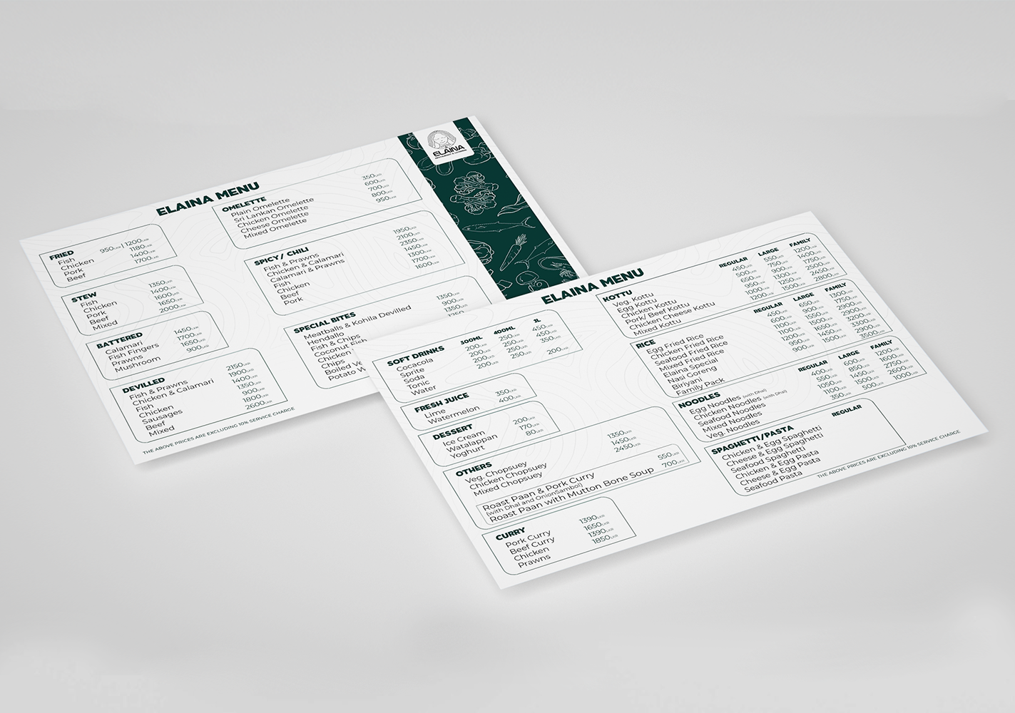
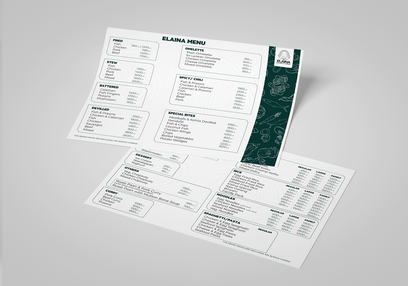
As a designer, I believe that the menu card for Elaina restaurant is a great example of effective and visually appealing design. The use of white space, color, and typography is all well-considered and contributes to the overall success of the design.
The white space on the menu card is used effectively to create a sense of balance and hierarchy. The ample white space around the text and images makes the menu card feel less cluttered and more easy to read. It also helps to draw attention to the key elements of the design, such as the dish names and prices.
The color scheme of the menu card is bright, vibrant, and eye-catching. The use of green and white is a great choice for a restaurant, as it evokes feelings of freshness and cleanliness. The colors are also used well to create a sense of contrast, which makes the menu card more visually stimulating.
The typography on the menu card is also well-chosen. The heading font is bold and easy to read, and the body font is clear and easy to scan. The different font sizes and weights are used effectively to create a sense of hierarchy, which makes it easy for diners to find the information they are looking for.